

To create a new design of the corporate website that better suited the current market and client and potential client needs. I project managed this project, presenting the design to the clients, taking feedback, setting expectations for delivery and deliverables, designing and building the website as well as working with other designers, web developers and system admin.
Initially set by the Managing Director of PrimarySite a brief was set to the design team to create a new design for the corporate website. The brief was small but had several important key areas.
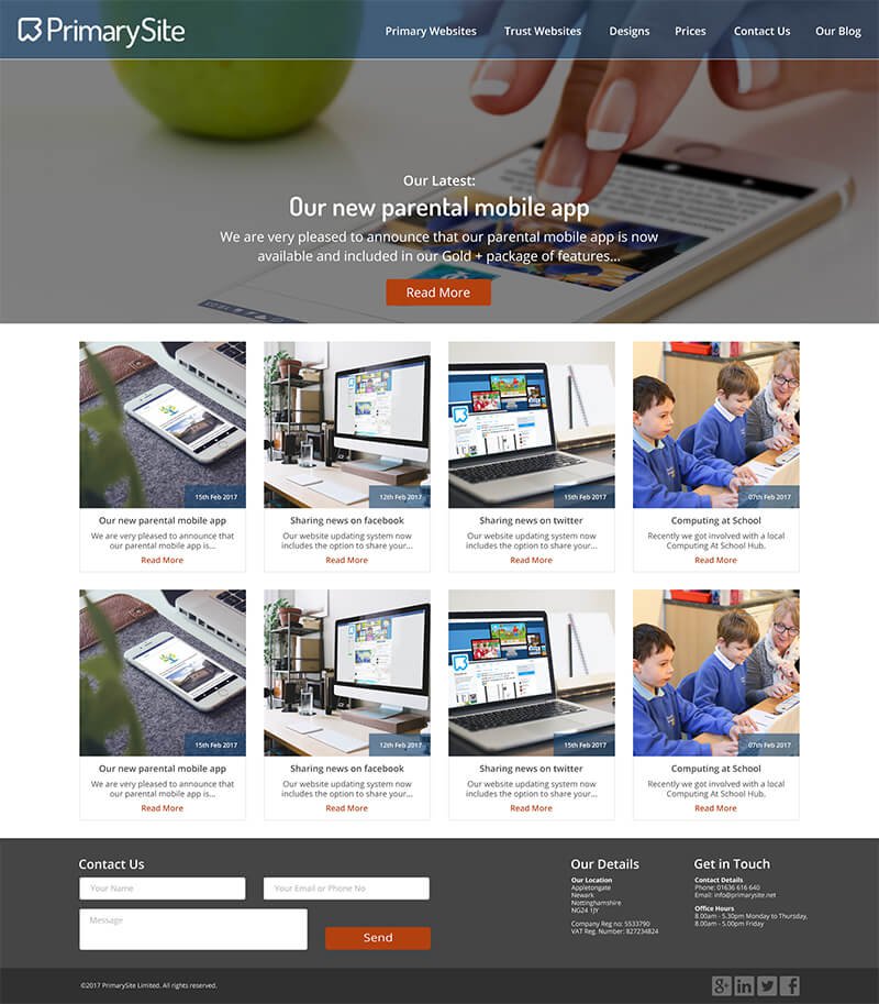
Follow the current navigation structure, marketing had already spent time analysing this area and the headings and appropriate navigation were appropriate for the current time.
Use current branding guidelines, colours were unset in the company except for the colours in the logo, but a font was already used in other marketing materials this was Dosis.
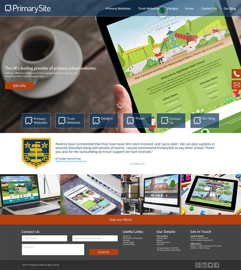
Incorporate more pictures and photos of products, previous corporate websites had gone down a more illustrative approach as illustrated websites were incredibly popular, following on from the success of rebranding formal designs, clients were going down the route of formal, photo based designs.
The client was then identified as the MD and Senior Leadership Team.
As I do in most projects, my first point of call with this project was research, what do our competitors websites currently look like? What do websites look like outside of the education sector. It was an important factor that PrimarySite is a market leader in the industry, as such they needed a website that set this.
An important factor I felt was essential within the website is what do school website clients say, testimonials are really powerful important statements that can potentially sway a new potential client.
After the research phase I then approached an initial colour way, it was important that it contained the original logo colours as these colours could be used throughout the website.
The colours selected can be found below.

This colour palette did evolve throughout the design as certain areas needed more definition than the palette could initially offer, the third colour in became a darker grey. The orange was a strong contrasting colour that allowed the CTA's to stand out so that a user could follow the journey through the website without links being hidden in the design.
The next step was to create a very rough user journey within the website, at the time the business was very much focused on potential clients contacting PrimarySite directly as there was a strong focus on person to person interaction instead of person to email interaction, as such, all journeys should eventually point to the contact page.
After the colours and the user journey work, initial designs were created, these incorporated, as per the brief, strong photography, a nod to all of our products and examples of websites in situ. I also wanted to use various staging images, including both desktop and responsive this at the time was a nod to a change in usage moving away from desktop and onto responsive, which in the education sector was a little bit of a slow change.


Once the designs were signed off, the website was constructed on the Django CMS Wagtail using HTML, CSS and JS. It was version controlled using a github repo and several people worked on it in different roles. The website was completed and deployed successfully.